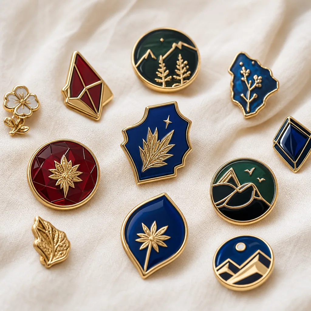
Small Text Specs for Custom Pins, Coins and Keychains
Why Approved Artwork Still Becomes Unreadable
Small text failures rarely come from a missing vector file. They happen because the artwork is approved at 300% zoom, then reduced to a 25 mm pin, stamped or cast into metal, polished, plated, enamel-filled and inspected under real lighting. A sponsor name that looks clean on screen can become a soft grey scratch after polishing rounds the metal edges or plating bridges a narrow letter gap.
For B2B orders, this is not a cosmetic annoyance. If an event date, sponsor name, QR caption, serial number or required legal line cannot be read, the item may fail its commercial purpose even when the factory followed the signed proof. The dispute is hard to resolve unless the RFQ defined minimum capital height, stroke width, contrast and inspection distance before tooling.
Treat small text as a manufacturing feature. The practical question is not whether the file is AI, PDF or EPS. It is whether the selected process, material thickness, plating, polishing method and QC standard can hold the letter geometry after production. ZheCraft normally flags risky text during artwork engineering, but the buyer should still state which words are critical and what readability standard applies.
Process Limits for Readable Text
Do not specify tiny text only by font size. A 6 pt condensed serif can be less readable than a 5 pt open sans-serif. Use measurable dimensions: capital letter height in millimeters, minimum stroke width, minimum internal gap and minimum distance from edges or cutouts. These values give the factory something to tool, polish and inspect.
Raised and recessed metal text needs enough wall width to survive die striking, casting, polishing and plating. Screen printing and UV printing can hold finer detail, but the mark sits on the surface and must pass adhesion and rub tests. Laser engraving is useful for serial numbers, names and short dates, but it loses contrast on mirror nickel or polished gold unless a matte area, black fill or darker plating is specified.
| Application | Preferred method | Minimum capital height | Minimum stroke or line | Production note |
|---|---|---|---|---|
| Raised die-struck front text | Soft enamel, hard enamel, coin relief | 1.2 mm minimum; 1.5 mm safer | 0.25 mm raised metal | Use open sans-serif fonts; avoid thin serifs and script |
| Recessed die-struck text | Coin rims, badge backs, keychain backs | 1.0 mm minimum; 1.3 mm safer | 0.22 mm recessed wall | Antique nickel, brass or copper improves shadow contrast |
| Laser engraved text | Serials, names, dates, batch codes | 0.8 mm minimum; 1.0 mm safer | 0.10-0.12 mm laser line | Best on brushed, matte, black nickel or filled engraving |
| Screen printed text | Flat badges, charms, acrylic or metal inserts | 0.7 mm minimum | 0.10 mm ink line | Needs flat surface; require tape and rub testing |
| UV printed text | Full-color keychains, magnets, badges | 0.6 mm minimum | 0.08 mm print line | Good detail; add clear topcoat for handled items |
| Backstamp legal text | Pin backs, coin backs, maker marks | 0.9 mm minimum | 0.18 mm line | Readable at close range, not suitable for arm’s-length branding |
Use these numbers as production-safe targets, not design ideals. If text must be read at arm’s length on a 25-30 mm pin, specify 1.5-2.0 mm capital height. If it is internal traceability read at 150 mm, 0.8-1.0 mm laser engraving may be acceptable. Text below 0.6 mm capital height should usually move to a backing card, insert card or carton label.
Match Wording to Product Size
A 40 mm challenge coin and a 25 mm lapel pin cannot carry the same wording. Many failures begin when a brand team tries to place a full slogan, venue, date, sponsor list and legal disclaimer on one face. The artwork then becomes crowded, or the factory must cut letters below the process limit.
For 20-30 mm pins, keep front copy to a short name, date or two-line phrase. For 35-60 mm brooches and badges, two short lines can work if the layout has open space and no tight curves. For 40-50 mm coins, rim text is reliable when letters are 1.3-1.8 mm high and not horizontally compressed. For keychains, go larger than the same artwork on a display item because glare, swinging movement and pocket abrasion reduce readability.
| Product type | Typical size | Practical front text limit | Recommended text spec |
|---|---|---|---|
| Lapel pin | 20-30 mm | 1-5 words | 1.5 mm capital height for brand-critical text |
| Brooch badge | 35-60 mm | Up to 2 short lines | Keep text 1.0 mm from curved edges and cutouts |
| Challenge coin | 40-50 mm diameter | Rim text plus short center copy | Rim letters 1.3-1.8 mm high; avoid condensed fonts |
| Metal keychain | 35-60 mm body | Logo plus URL, date or short name | Use matte or antique contrast if text is small |
| Fridge magnet badge | 40-70 mm | 2-4 short printed lines | Flat UV or screen print can carry more copy than relief metal |
| Woven patch | 50-100 mm | More copy possible | Woven handles smaller text than embroidery; keep embroidery above 4-5 mm |
Define the viewing requirement in the RFQ. Text on a trade show badge that must be read from 700 mm needs a different spec from a batch code read at 150 mm. A useful rule is to print the proof at actual size and review it at the intended distance before approving tooling. If it fails on paper, metal production will not improve it.
Fonts, Spacing and Layout That Survive Production
The safest small text uses open, simple sans-serif fonts with moderate weight. Avoid hairline type, condensed type, script, distressed effects and tiny counters inside letters such as a, e, o, p and R. Even if a die can cut the shape, polishing and plating can close small gaps or soften letter corners.
For die-struck or die-cast metal, keep internal gaps at 0.20-0.25 mm minimum. Keep enamel channels beside text at 0.30 mm or wider; narrower channels can trap air, underfill or polish unevenly. For hard enamel, expect raised metal lines to be polished flush, so very fine strokes can lose definition. For soft enamel, deep recesses improve color separation, but the raised metal still needs enough width to plate consistently.
- Set raised front text at 1.2 mm capital height minimum; use 1.5 mm or larger for sponsor and logo names.
- Keep die-struck stroke width at 0.25 mm or more and recessed letter walls at 0.22 mm or more.
- Maintain at least 0.20 mm gap between letter strokes, borders, enamel pools and nearby metal lines.
- Keep small text at least 1.0 mm from outside edges, holes, bottle-opener cutouts and sharp corners.
- Avoid tight curved microtext; increase coin-rim letters when the diameter is below 35 mm.
- Send editable vector artwork or outlined paths plus a 1:1 scale PDF; do not use flattened low-resolution images.
Orientation should be specified, especially on keychains and charms. The attachment hole determines how the item hangs. If a logo reads correctly only in one position, state the hole location, split-ring or swivel type and final reading direction in the approval file. Otherwise a technically correct item may hang sideways in use.
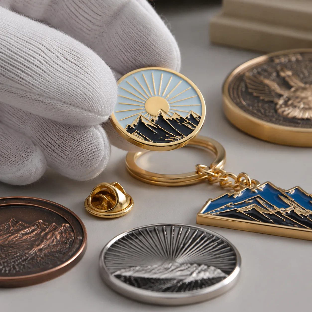
Contrast, Plating and Surface Finish
Legibility depends on contrast as much as size. Polished gold text on polished gold background may be raised but unreadable. Mirror nickel can hide laser engraving because reflections overpower the mark. Antique plating, matte plating, sandblasted backgrounds and dark fill in recessed letters can make the same text readable without increasing its size.
For raised metal text, use contrast between metal and surrounding enamel when possible. Polished nickel or gold against black, navy, dark green or red enamel usually reads well. For recessed coin text, antique nickel, antique brass or antique copper works because darker oxidation remains in low areas while raised surfaces are polished brighter. For printed white text on a dark base, specify topcoat and rub resistance if the item will be handled daily.
| Finish choice | Legibility effect | Typical thickness or layer | When to avoid |
|---|---|---|---|
| Polished nickel | Clean but reflective | 3-5 microns nickel over copper underplate | Avoid for tiny laser text without matte panel |
| Black nickel | High contrast with light enamel | 3-5 microns nickel-equivalent finish | Avoid with dark enamel or black printed text |
| Antique brass | Strong relief contrast | 3-5 microns finish over copper | Avoid when the brand requires bright modern gold |
| Matte gold | Less glare than polished gold | 0.05-0.10 micron gold flash over nickel | Avoid for heavy key wear without packaging or coating |
| Black fill in recessed engraving | Very readable at close range | Paint or enamel fill, not plating | Avoid below 0.30 mm channels or high-rub raised zones |
| Printed white on dark base | Fine detail possible | Ink layer about 8-15 microns | Avoid without adhesion, tape and rub checks |
Gold flash is mainly decorative. On budget promotional pins and keychains, it is normally a thin color layer over nickel, not thick jewelry plating. If the item will live on keys or bags, specify individual polybagging, rub testing and acceptable color shift instead of relying on a premium-looking plating name.
MOQ, FOB Cost and Lead-Time Impact
Small text does not always increase unit cost. Raised or recessed wording included in the main die usually has no separate unit charge, provided the text is above the process limit. Costs rise when readability requires an extra print pass, UV layer, laser personalization, black fill, revised tooling or a physical pre-production sample.
Typical MOQ for custom enamel pins and metal keychains is 100 pieces for trial orders, 300-500 pieces for commercial pricing and 1,000+ pieces for stronger unit economics. Challenge coins are practical from 100 pieces, but 300 pieces lowers the tooling burden per unit. Patches and lanyards often start at 100-300 pieces, while event programs usually price better at 500 pieces and above.
| Specification choice | Typical added FOB cost | Added lead time | Buyer trade-off |
|---|---|---|---|
| Standard die-struck text above limit | No separate unit add-on; tooling included | 0 days | Lowest cost, limited by polishing and plating tolerance |
| Laser engraved serials or names | USD 0.05-0.18 per piece | 1-3 days | Good traceability; weak contrast on mirror finishes |
| Screen printed small text | USD 0.03-0.12 per color per piece | 1-2 days | Fine detail; lower abrasion resistance |
| UV printed fine text | USD 0.08-0.25 per piece | 2-4 days | Best detail; require adhesion and rub checks |
| Recessed text with black fill | USD 0.04-0.15 per piece | 1-3 days | High contrast; messy below 0.30 mm channels |
| Second sample after text change | USD 30-80 if tooling changes | 5-8 days | Useful when sponsor, legal or event text is critical |
After artwork approval, normal production lead time is about 12-18 days for enamel pins and simple metal keychains, 15-22 days for challenge coins, 10-18 days for patches and 8-15 days for lanyards. Add 5-8 days for a physical pre-production sample and 3-7 days for international express shipping, depending on destination and customs. For FOB budgeting at 300 pieces, a 25-30 mm soft enamel pin often falls around USD 0.45-0.95, a 45 mm die-cast keychain around USD 0.80-1.80 and a 45 mm challenge coin around USD 1.60-3.50, depending on thickness, plating, enamel count, edge style and packaging.
Inspection Criteria for Legible Text
Readable text must be inspectable. Instructions such as “make sponsor names clear” are too subjective. Define distance, lighting, sample size, magnification if allowed and reject conditions. This turns a design preference into a QC checkpoint that can be applied during first-article review, in-process inspection and final AQL inspection.
For normal promotional metal products, many importers use AQL 2.5 for major defects and AQL 4.0 for minor defects under ANSI/ASQ Z1.4 or ISO 2859-1 sampling. Unreadable required text should be classified as a major defect when it affects a logo, sponsor name, event name, date, URL, safety mark or compliance statement. Minor defects may include slight fill variation or small edge softness that does not affect reading at the agreed distance.
- Inspect required front text at 300 mm under 600-1000 lux neutral white light.
- Inspect backstamp or traceability text at 150 mm, with 3x magnification only if agreed before production.
- Reject raised letters with broken strokes, filled counters or plating bridges that change the word.
- Reject printed text if ink bleed exceeds 0.15 mm on critical letters or reduces letter gaps below spec.
- Set measurable letter-height tolerance at ±0.10 mm and overall item size tolerance at ±0.30 mm unless otherwise agreed.
- Keep a signed golden sample and inspect production against both the sample and the approved 1:1 artwork.
Request mixed-position inspection from cartons and production trays because polishing and plating can vary across batches. For large orders, separate first-article approval from final inspection. Catching a closed letter counter after the first 20 pieces is inexpensive; finding it after 20,000 packed pieces is not.
RFQ Details That Prevent Small-Text Failures
A strong RFQ tells the supplier when to push back before tooling starts. Include final product size, material, thickness, plating, text purpose, critical wording, viewing distance, MOQ, delivery date and target budget. Mark each text element as critical, useful or decorative. Critical text needs minimum size, contrast, inspection criteria and usually a physical sample. Decorative microtext can be simplified or removed if it creates tooling risk without adding value.
If the artwork includes legal copy, sponsor lists, multilingual text, website addresses or QR captions, identify what cannot be edited and what may be shortened. Often the best production decision is to move legal text to the backer card, polybag label, insert card or carton sticker instead of forcing it onto a 25 mm metal face. That is not a downgrade; it is how the front item stays readable and clean.
- State final dimensions and material, such as 30 mm iron pin at 1.5 mm thick or 45 mm zinc alloy coin at 3.0 mm thick.
- Specify the preferred text process: raised metal, recessed metal, laser engraving, screen print, UV print or packaging print.
- Give minimum capital height, stroke width, internal gap and edge-clearance requirements for critical text.
- Define plating and contrast, such as antique nickel for recessed coin text or matte black behind polished nickel letters.
- Confirm inspection distance, lighting, AQL level and whether unreadable critical text is a major defect.
- Request enlarged artwork proof, 1:1 scale PDF and, for critical programs, a physical sample before mass production.
Before sending the order to ZheCraft or another factory, print the artwork at actual size and read it at the intended distance. If the buyer, sponsor or event manager cannot read it on paper, reduce wording, enlarge letters or move secondary copy to packaging. Then ask the factory to mark any text below process-safe limits before quoting. That single review step prevents the most expensive small-text problem: a shipment that matches the approved artwork but fails the purpose.
Have a project? Send your artwork and target quantity and we’ll reply with a detailed quotation within 12 working hours.
Ready to get this made?
Send your sketch, target quantity and ship-date. Detailed quotation in 12 hours.