Should You Choose Die-Struck, Printed, or Molded Promos?
Start With The Use Case, Not The Decoration
Most sourcing mistakes happen because buyers start with the decoration method instead of the job the item must perform. A conference badge, retail giveaway, long-life corporate gift, and outdoor event handout all fail for different reasons: one needs low unit cost, another needs crisp branding, another must survive abrasion, and another must stay readable after rain, sweat, or bag friction. If you choose the build first, you often pay for detail you do not need, or you pick a process that looks good in photos but fails in handling.
For promo hardware, the first question is whether the artwork is primarily line-based, color-based, or form-based. Line-based art usually suits die-struck or engraved builds; color-based art usually suits printed, soft enamel, or molded fills; form-based art with realistic curves may push you toward 3D cast or molded parts. A useful internal rule is to define the failure mode you can least tolerate: scuffing, fading, warping, or reorder variation. That one constraint usually determines the right process faster than any mood board.
ZheCraft sees the cleanest projects when buyers write the use case in one sentence before asking for quotes. Example: “A 35 mm lapel pin for weekly wear on jackets, with no exposed print, 12-month acceptable appearance, and a premium plated look.” That sentence gives engineering, finishing, and QC a target that can be measured.
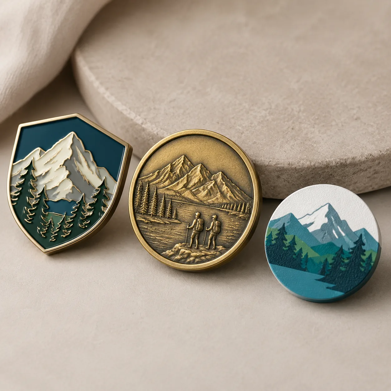
What Die-Struck, Printed, And Molded Actually Mean
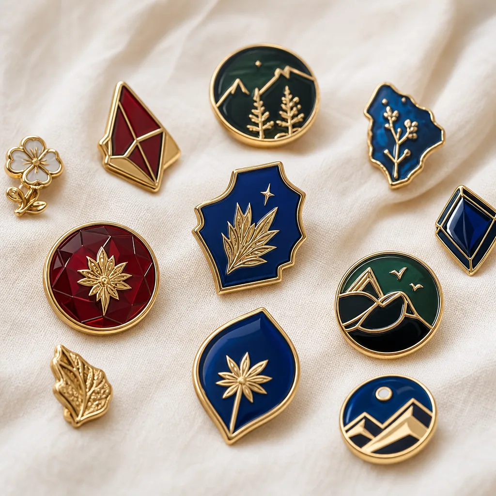
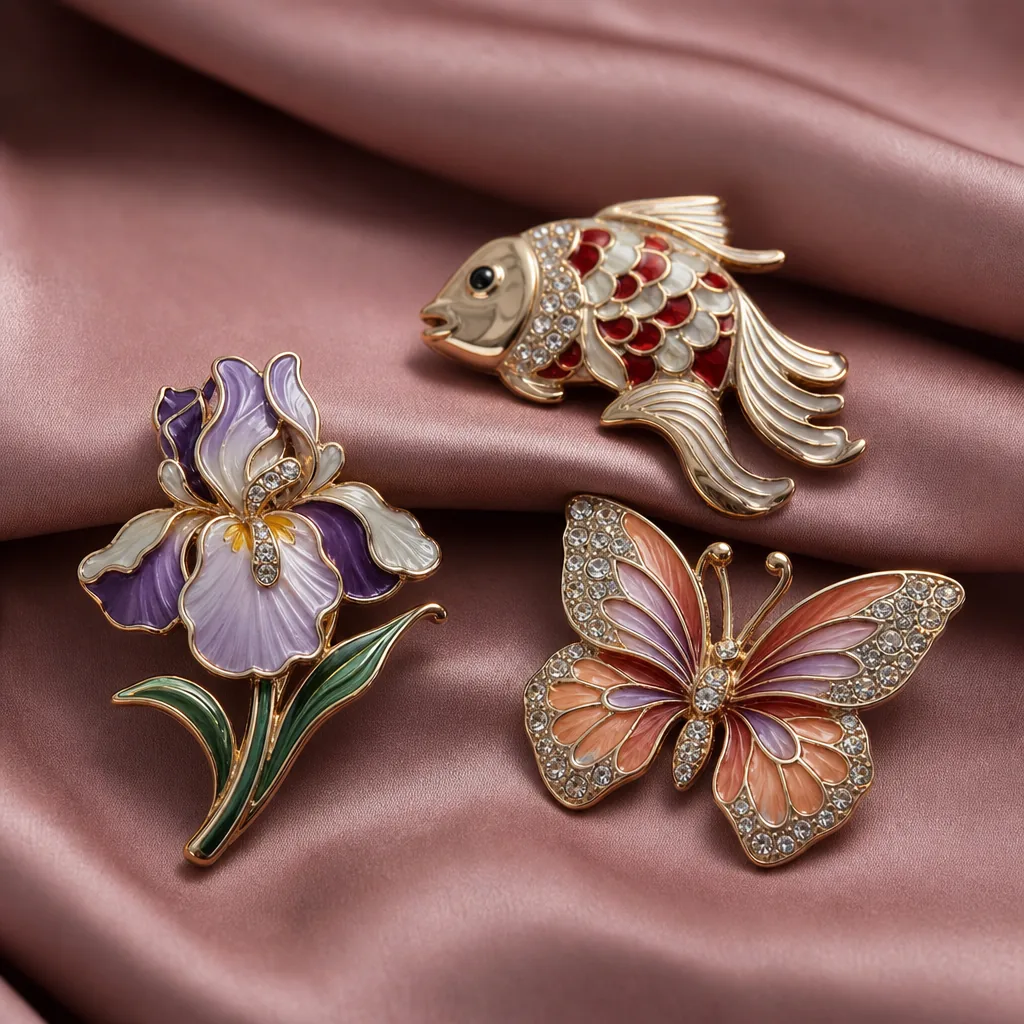
Die-struck products rely on raised and recessed metal areas, with or without enamel or paint fill. They usually deliver the sharpest edge definition at moderate cost, especially when the artwork has strong outlines, a few color blocks, and a premium metal finish. Printed products excel when you need fine gradients, small text, photo-like artwork, or quick translation from a digital file. Molded products are better when the shape itself is the brand, such as mascots, thick contours, or rounded forms that need a softer tactile finish.
In factory terms, the three paths differ in tooling complexity, decoration tolerance, and surface durability. Die-struck tooling is often the most economical for repeat volume because the cavities are simpler and the finish is easier to standardize. Printing is often the fastest path to sample, but final durability depends heavily on ink system, cure schedule, and topcoat selection. Molded builds are the most forgiving for sculptural shapes, but they can lose fine detail if the artwork is too small or too busy.
Typical production limits are useful when you are comparing quotes. For die-struck or cast metal, line widths below 0.20 mm are high risk, 0.25 mm is workable only with disciplined tooling, and 0.30 to 0.40 mm is safer for repeat output. Recess depth around 0.30 to 0.80 mm gives readable contrast without making the piece fragile. For printed art, text smaller than 4 pt on a curved or handled surface often becomes unreadable after wear. For molded edges, a minimum wall or rib thickness around 1.0 to 1.2 mm is more realistic than trying to hold knife-edge detail in production.
| Build path | Best for | Typical strength | Main trade-off |
|---|---|---|---|
| Die-struck | Clean logos, event pins, premium giveaways | Strong edge definition and premium feel | Less suitable for photo-like detail |
| Printed | Tiny text, gradients, multi-color art | Best color fidelity and fastest artwork translation | Surface wear if unprotected |
| Molded | Mascots, thick shapes, soft contours | Best sculptural depth and tactile shape | Can blur small details |
| Hybrid metal + print | Brand pieces needing both edge and color | Combines relief and high color complexity | More process steps and QC points |
Durability Versus Visual Complexity
This is the trade-off that usually decides the order. If you need a piece that looks excellent on day one and still acceptable after months of handling, you want conservative decoration and durable geometry. That means thicker strokes, fewer tiny islands, and less dependence on exposed surface ink. If the item is meant for a short campaign life, you can accept more visual complexity and lower abrasion resistance.
For printed pieces, ask whether the artwork can tolerate edge wear, micro-scratches, and UV fade. On outdoor handouts, UV-stable inks and a hard clear coat matter more than a brighter screen preview. For die-struck or enamel pieces, ask whether tiny recessed areas will trap dust or whether shallow relief will disappear under bright ambient light. For molded parts, ask whether the form remains recognizable if the piece is simplified by 10 to 15 percent for tooling stability. These are not theoretical checks; they directly affect rejection rates and reorder consistency.
If the goal is a premium look, use the surface finish to do more of the work than the decoration. Satin metal, polished raised edges, controlled matte backgrounds, and disciplined color placement often outperform busy graphics. A well-designed 30 mm lapel pin with one plated accent and one enamel fill usually reads more premium than a crowded full-color piece at the same size. Buyers often overdesign because they want every brand element visible at once, but the strongest promo pieces usually have one dominant visual and one support element.
Specs That Change The Outcome
Two samples can look similar on a desk and behave very differently in production. The key specs are line width, relief depth, overall thickness, edge treatment, plating stack, color tolerance, and the allowable wear level. For small metal promo items, a total thickness around 1.2 to 1.5 mm suits lightweight giveaways, while a more premium die-struck piece often lands closer to 1.5 to 2.0 mm depending on size and structure. For molded parts, 1.8 to 3.0 mm is more common when a sculptural feel is required.
Tolerance control matters as much as appearance. For flat or lightly formed items, a dimensional tolerance of +/-0.20 mm is a realistic planning target; for more complex molded geometry, +/-0.30 to 0.50 mm is more typical. Color work should be judged with a practical production standard, not a designer’s monitor. Spot colors are usually controlled to a visual delta E target around 3 to 5 for repeatability, while printed gradients should be checked for banding and dot gain rather than exact spot matching. If a supplier cannot state the control method, the color standard is probably informal.
Finish systems should be chosen after the geometry is locked. Polished nickel, antique brass, matte black, soft gold, and dual-plated combinations each interact differently with recesses and tiny text. If the artwork depends on contrast, a darker recess and brighter raised surface usually reads better than relying on color alone. For wear-heavy items, a clear epoxy or UV topcoat can extend life, but it also changes sheen and can reduce tactile sharpness if applied too thickly.
A practical QC target for many promo items is to inspect appearance at AQL 2.5 for major defects and AQL 4.0 for minor defects, with critical defects at zero acceptance. That matters because the right visual spec is useless if the factory is not measuring it against a defined inspection plan. Buyers should ask whether the sample represents final tooling, whether edge burrs were manually removed, and whether the approved plating tone is the same bath used in production.
Cost, MOQ, And Lead Time Reality
Broad price bands are more useful than fake precision. Simple die-struck items at moderate volume often sit around USD 0.40 to 1.20 FOB depending on size, plating, and packing. Printed pieces can be similar or slightly lower for very flat artwork, while molded or more complex hybrid builds often move into the USD 0.80 to 2.50 FOB range once tooling and finishing are included. If you need premium plating, soft enamel fill, custom backing, or individual polybagging, expect the total to move up quickly even when the base geometry is simple.
MOQ follows the same logic. Clean, repeatable builds usually tolerate lower MOQs, often 100 to 300 pieces for straightforward work, while more complex molded or hybrid designs more often make sense at 500 pieces and up. For first orders, a practical tiering approach is 100 to 299 units for simple repeat items, 300 to 499 units for most standard custom promo hardware, and 500 to 1,000 units when multiple finishes or custom shapes are involved. Tooling charges are separate and can dominate low-volume orders, especially for sculpted or multi-step pieces.
Lead time is also process-dependent. A simple repeatable item may ship in 12 to 18 days after sample approval, while a more complex first order can run 18 to 30 days depending on plating queue, finishing load, and packing requirements. If a supplier promises very low MOQ and very fast lead time on a visually complex design, ask where the trade-off is hidden. Common shortcuts include softer QC, looser color matching, simplified relief, reduced plating steps, or packaging changes that are not obvious in the quote.
A quote should let you see which spec is driving price. Look for separate treatment of tooling, plating, fill, printing, backing, and packing so you can tell whether the premium is coming from geometry or decoration. At ZheCraft, separating those elements early helps buyers decide whether to simplify art, reduce finishes, or keep the design and trim the packaging stack instead.
How To Read A Quote Like A Factory Buyer
A good quote does more than show a unit price. It should show mold or die cost, material basis, finish process, expected tolerance, packing method, and whether the factory is quoting on FOB, EXW, or DDP terms. If the item is priced on FOB, ask what port is used and whether local trucking or export paperwork is included. If the supplier only provides a lump sum, it becomes difficult to see whether the real cost is in tooling, labor, or a margin loaded into the finish step.
The most useful comparison is not between two price totals, but between the actual process stacks. For example, a printed item with a clear coat and custom backing may cost less than a die-struck item with dual plating and polished edges, even though the first quote looks “more decorated.” On the other hand, a molded mascot with low detail may be cheaper than a metal hybrid if the shape can be cast in one shot and packed simply. The process stack, not the headline description, determines the economics.
If you are balancing budget against brand value, decide which line items are non-negotiable. For some buyers, plating tone and edge feel are essential; for others, color accuracy and fast reorder turnaround matter more. The right quote is the one that preserves the non-negotiables while removing avoidable complexity.
What To Ask Before You Approve A Sample
A sample should answer production risk, not just visual taste. Ask for the exact plating tone, target thickness, packing method, and whether the sample is made from final tooling or from a hand-made pre-sample. If you skip that distinction, you may approve something that cannot be repeated economically at mass production scale.
- Confirm which details are fixed and which are sample-only.
- Ask for the smallest line, smallest text, and shallowest recess in the design.
- Check the surface by rubbing edges and high points for sharpness or snag risk.
- Verify whether colors are spot-matched, printed, or approximate.
- Ask for a reorder reference so the same build can be repeated later.
For acceptance, inspect the sample the way the end user will use it. Pin it to fabric, clip it to a bag, put it under bright light, and handle it for a minute. If a badge scratches clothing, if a printed logo smears when rubbed, or if a molded edge feels too soft to read the form, the production piece will show the same issue. The safest approval process is to compare the sample against the use case, not against a render.
A Practical Selection Checklist
Use this checklist when you need a quick internal decision before RFQ or sample approval:
- Choose die-struck if you want strong metal definition, restrained color, and a premium look.
- Choose printed if the design needs gradients, small text, or faster artwork conversion.
- Choose molded if the brand depends on 3D shape, rounded contours, or mascot styling.
- Use hybrid builds only when both relief and color are mission-critical.
- Set the MOQ, lead time, and FOB target before asking for samples.
- Specify tolerance, thickness, and color standard in the first RFQ.
- Reject any sample that depends on hand finishing that cannot be repeated at scale.
If you are still deciding, sort the project into one of three buckets: line-driven, color-driven, or shape-driven. Then decide whether your bigger risk is wear, visual complexity, or reorder inconsistency. That single exercise usually eliminates two of the three build paths before you spend time on samples. A one-page spec is often enough to prevent a costly second round.
For the next step, send your supplier a short RFQ that states use case, target MOQ, expected life, finish preference, tolerance target, and the one failure you cannot accept. If you already have artwork, ask for a manufacturability check before quoting. If you want, ZheCraft can help turn a rough concept into a production-ready spec so the first sample is much closer to final output.
Have a project? Send your artwork and target quantity and we’ll reply with a detailed quotation within 12 working hours.
Ready to get this made?
Send your sketch, target quantity and ship-date. Detailed quotation in 12 hours.