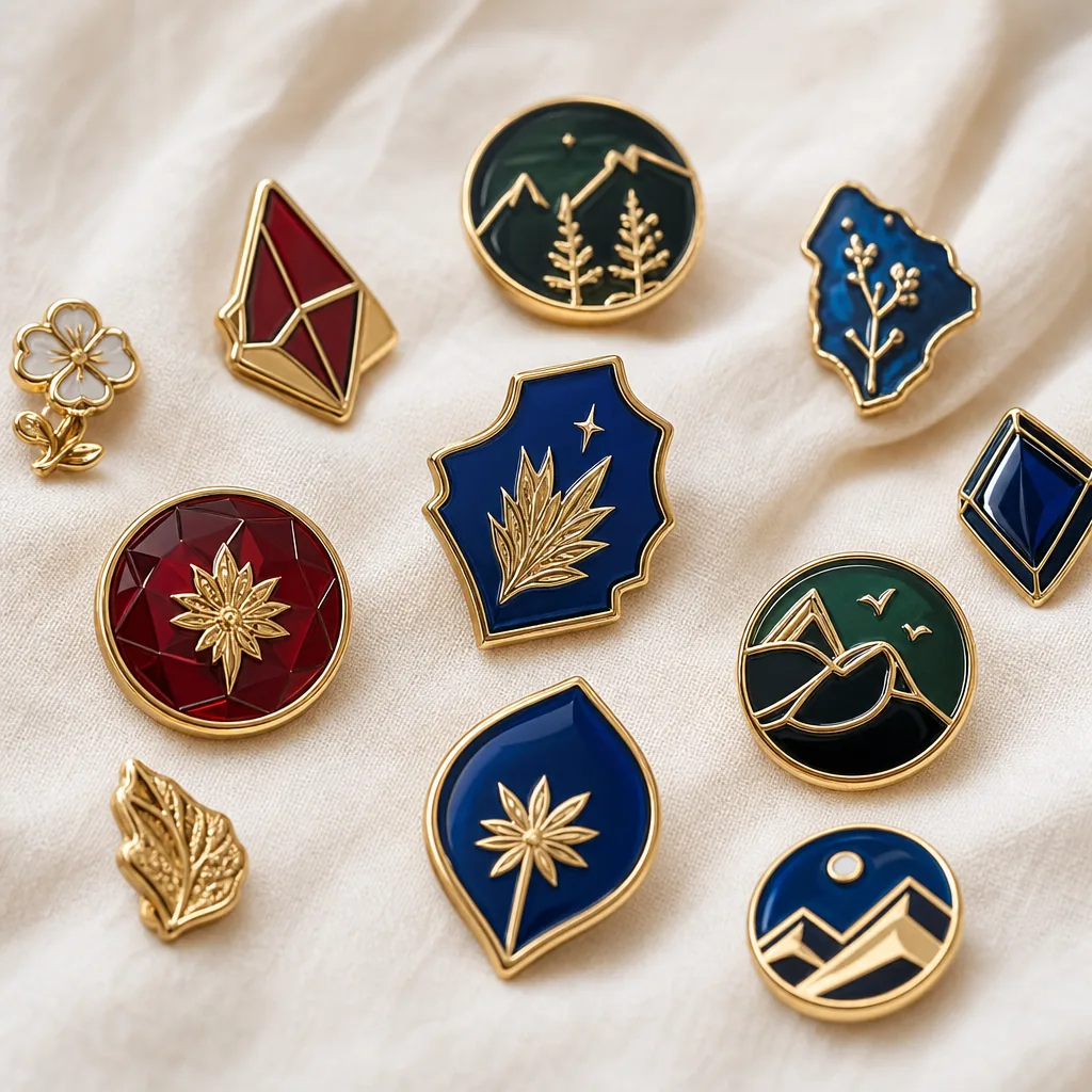
Offset vs Screen vs Woven: Choosing the Right Look
The buyer problem: three methods, one standard
When buyers source pins, patches, and lanyards across multiple SKUs, the real question is not which decoration method looks best in isolation. It is which process can hold brand color, line detail, hand-feel, and target cost without creating approval churn between suppliers. Offset printing, screen printing, and woven construction can all be right, but they solve different problems and fail in different ways.
This comparison is written for procurement teams, promo distributors, and event buyers who need repeatable specs rather than design language. The right choice usually comes down to image complexity, minimum text size, substrate stability, wear cycle, and whether the product needs a flat graphic, a tactile surface, or a textile finish. The most common sourcing mistake is asking one process to do every job, then paying for rework when the artwork is not matched to the process.
Use viewing distance and abrasion as the first filters. A conference badge seen at 50 cm can tolerate different detail than a woven staff lanyard worn daily for six months, and a pin face printed on metal has different tolerance limits than a soft patch sewn to fabric. If those use cases are not separated at RFQ stage, quotes may look comparable while finished goods do not.
| Spec | Offset printing | Screen printing | Woven construction |
|---|---|---|---|
| Best for | Full-color gradients, photos, tiny type, multi-color art | Solid spot colors, bold logos, simple shapes, high-opacity coverage | Text-heavy patches, badges, clean line art, premium textile look |
| Typical base / build | 0.8-1.5 mm flat substrate with printed layer and clear coat or laminate | Fabric, PVC, metal, or paper with ink layer; ink film typically 15-40 microns | 1.2-2.5 mm textile body; thread density often 100-300 denier equivalent yarn |
| Minimum text height | 2.0-2.5 mm practical; 3.0 mm preferred on dark or textured bases | 1.8-2.5 mm practical; 2.5 mm preferred for long-run readability | 4.0 mm practical; 3.0 mm only with dense weave and simple font |
| Minimum line width | 0.15-0.20 mm on flat coated surfaces | 0.25-0.30 mm, with thicker lines preferred on flexible items | 0.35-0.45 mm; 0.50 mm safer for small text or reversed type |
| Color handling | Good for CMYK imagery; Pantone matching limited by substrate and ink set | Strong for Pantone spot colors; best at 1-6 colors | Moderate; thread palette constrains exact Pantone matching |
| Registration tolerance | ±0.20-0.30 mm on flat parts | ±0.30-0.50 mm depending on substrate stretch | Weave pull and border shift typically ±0.5 mm; design must allow it |
| Typical MOQ tier | 300-500 pcs for standard promo runs; 100-200 pcs possible with surcharge | 200-300 pcs typical; 100 pcs on simple repeat jobs | 100-300 pcs typical; 50-100 pcs possible for stock-style formats |
| Lead time | 12-18 days after sample approval; 3-5 extra days if art changes | 10-16 days after sample approval; 2-4 extra days if multiple screens are remade | 14-21 days after sample approval; 4-6 extra days for complex weave approvals |
| FOB price range | USD 0.18-0.65/pc for small to medium runs | USD 0.12-0.55/pc for 1-6 color jobs | USD 0.35-1.20/pc depending on size and stitch density |
| Main risk | Color shift on dark or textured surfaces; coating wear on high-friction use | Cracking or edge wear if cured poorly or flexed repeatedly | Lost detail when artwork is too small or font weight is too light |
Offset printing: best when the artwork carries the sale
Offset printing is strongest when the buyer wants photographic detail, smooth gradients, or a large number of colors without hard separations. It performs well on flat, stable surfaces such as metal plates, paper cards, coated inserts, acrylic parts, and some rigid PVC panels. In promo sourcing, offset is often the closest fit to “print exactly what the file shows,” provided the substrate is smooth and the image area is not heavily bent or abraded.
For custom products, offset is usually the lowest-risk path when the logo includes shadows, small type, or a complicated illustration. A realistic spec is a clean trim margin of 0.5 mm, artwork tolerance of ±0.2 mm to ±0.3 mm, and a protected image area if the item will be handled frequently. Ask for gloss or matte laminate, UV coat, or epoxy dome only when the product can support it; otherwise coating may distort fine text or mute color saturation.
Offset is less suitable when the design depends on thick tactile color, raised edges, or a premium textile look. It also becomes weaker on highly curved surfaces because registration drift, film distortion, and visible edge gain increase as geometry bends. If the program needs exact Pantone matching across metal and textile items, offset may be one part of the system, not the entire solution.
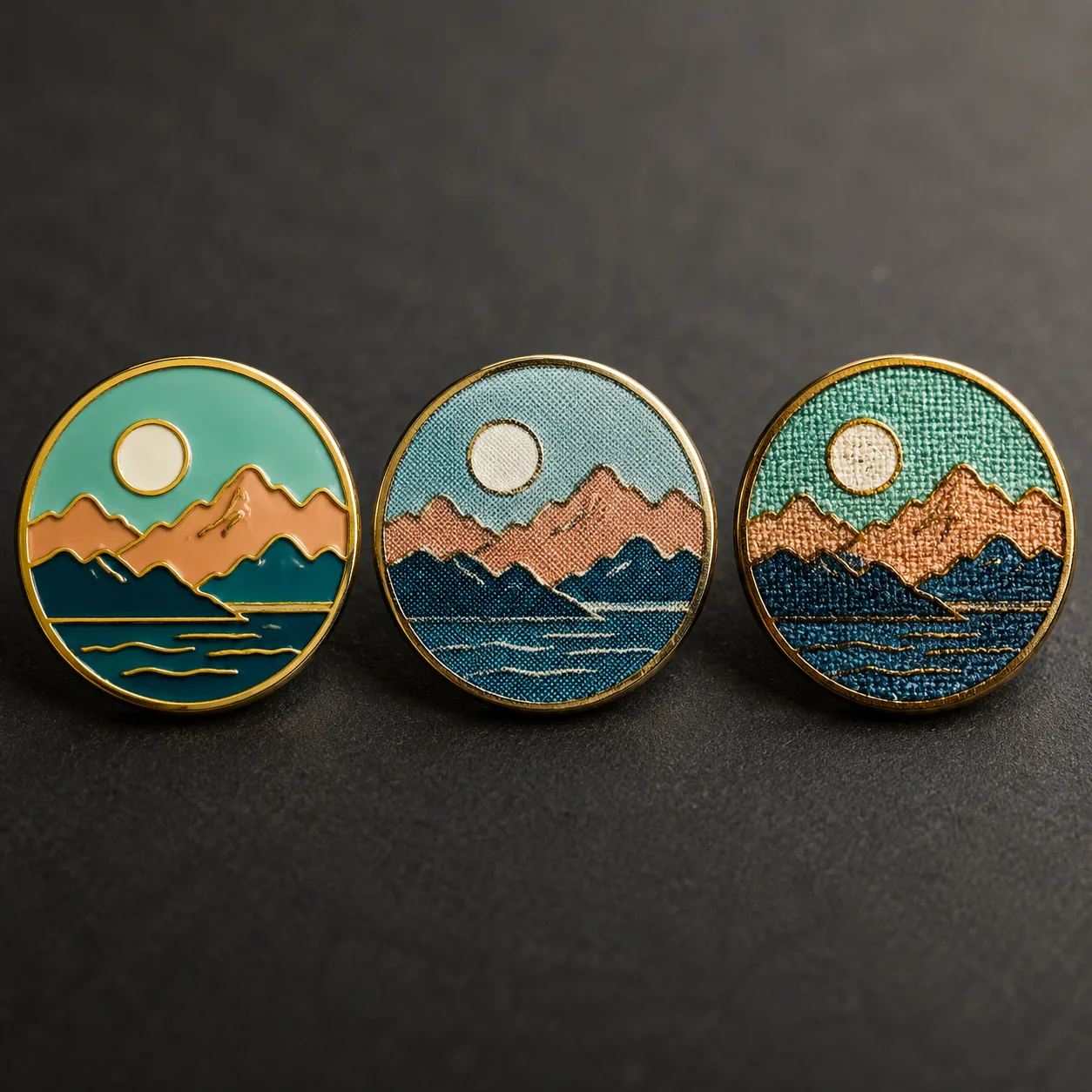
A concrete example: a commemorative pin face with a photo background, silver border, and a 2.2 mm event title is a good offset candidate. The same design on a lanyard tail or soft patch is not, because substrate movement and wear change the acceptable detail level. Buyers who force one file into both formats often simplify the artwork twice, which costs more than choosing the correct process once.
For supplier control, ask for a print proof on the actual base material, not just a PDF. On dark substrates, confirm overprint behavior and expected delta E against the approved Pantone chip. If the factory cannot name the coating thickness or lamination type, the quoted price is not directly comparable to one that does.
Screen printing: best for brand color and bold simplicity
Screen printing is the most controllable option when a design uses a small number of strong spot colors. It produces opaque coverage, which is valuable on dark substrates where lighter print methods can look washed out. For lanyards, badges, soft PVC, and some patch styles, screen printing remains the workhorse process when artwork has clear blocks, readable type, and no need for photographic gradients.
The trade-off is ink thickness. On flexible products, a thicker ink deposit can feel slightly raised, and on repeated bend points it can crack if the base material is poor or the cure is underdone. A practical spec starts at 1-6 colors, 0.25 mm minimum line width, 1.8 mm minimum text height, and a cure standard that survives at least 50-100 bend cycles on flexible goods without visible flaking. If the supplier cannot state curing temperature and dwell time, risk rises quickly.
Screen printing usually gives the best balance of cost and clarity for giveaways that need quick visual impact. If your brand standard relies on exact Pantone spot reproduction and the layout does not require gradients, this is often the first process to quote. If the design contains tiny halftones, tight reverses, or many color transitions, it becomes slower and more failure-prone than offset or woven construction.
Example: a two-color sponsor logo on a 20 mm polyester lanyard, printed in white and PMS 186 red on navy ribbon, is a strong screen-print case. A six-color festival badge with tiny sponsor text and photo-like artwork is not, because the screen count, setup time, and registration risk increase without adding much value. In short, screen printing wins when clarity matters more than image realism.
For buyer-side quality control, request rub resistance and wash guidance where relevant. A common benchmark for printed fabric is 20-40 dry rubs or 5-10 home washes before noticeable degradation, depending on base fabric and ink system. On rigid products, ask for edge chipping and scratch expectations in writing rather than relying on “durable” as a general claim.
Woven construction: best for textile detail without print feel
Woven construction belongs in the conversation when the buyer wants a textile product that feels integrated rather than printed on top. It is especially useful for patches, badges, and some lanyard styles where thread density creates the image itself. The result is clean, durable, and less prone to surface scratching than many print-based methods.
Woven is not the answer for every logo. Very small typography, ultra-fine separations, and smooth tonal shading can disappear when translated into thread, so artwork must be simplified at the source. A practical spec is 0.35-0.45 mm minimum line width, 4.0 mm preferred text height, and 0.5 mm minimum negative-space channels if the design contains inner counters or reversed type. The best woven art uses strong outlines, medium-weight fonts, and limited micro-detail.
This method is usually the best choice when hand-feel matters and the product will be worn or washed. A woven patch with a merrowed border may survive more abrasion than a printed patch because the image is part of the textile structure rather than sitting on the surface. That said, woven construction typically costs more than screen printing because loom setup, thread matching, and border finishing add labor. If the order is purely graphic and you want the lowest unit cost, woven may be overkill; if you need a premium textile appearance with long wear life, it is often the right answer.
A concrete use case is a club badge with a three-line name, a simplified crest, and a two-color background. A woven version can keep the badge looking clean after repeated washing or abrasion, while a printed version may show scuffing at the corners first. The trade-off is that a 2.5 mm serial number or a fine slogan line may blur into the weave, so the artwork has to be designed for the method from the start.
If the patch is intended for uniforms, ask for thread count, border construction, and backing type explicitly. Typical woven patch builds use 100-150 denier face yarns, merrowed edges for outer dimensions above roughly 60 mm, and heat-cut or laser-cut edges for smaller shapes. For inspection, a supplier should be able to hold border shift within about ±0.5 mm against the approved sample and keep color blocks visually even at arm’s length.
Which method wins by buyer priority
The wrong way to compare these methods is to ask which one is universally best. The better question is which one optimizes the top priority without creating hidden costs later. For procurement, those hidden costs usually show up as artwork revision time, sample delays, color disputes, and replacements after use.
- Need photographic detail or many colors: choose offset printing.
- Need strong spot colors and low setup complexity: choose screen printing.
- Need textile feel and long-wear durability: choose woven construction.
- Need the lowest MOQ on a simple design: screen printing or woven often beat offset.
- Need the most readable tiny text on a flat surface: offset usually wins.
- Need the most premium fabric appearance: woven usually wins over printed fabric.
If two methods are close on paper, choose the one that matches the failure mode you can tolerate. For example, a conference badge with a complex sponsor map can tolerate a flat printed surface, but a staff lanyard that must survive months of use may justify woven construction even at a higher unit price. That is the kind of trade-off that saves money after launch, not just on the first quote.
Another useful filter is performance under inspection. Offset can look excellent in a photo but reveal edge shift under close inspection, while screen print can look less refined in macro view but read better from a few feet away. Woven often looks the most premium at normal wearing distance because the texture does part of the visual work. Match the process to how the buyer, end user, and approver will actually judge it.
A simple decision rule helps: choose the process that preserves the one feature your stakeholder will notice first. If marketing will judge color fidelity, favor offset or screen print. If operations will judge wear and wash life, favor woven. If retail buyers will judge perceived value, woven or well-finished offset usually wins over plain screen print.
How to write the spec so factories quote the same thing
Most comparison failures start with vague artwork instructions. One supplier quotes offset on a coated base, another quotes screen print on polyester, and a third assumes woven fill density that the buyer never requested. To compare quotes fairly, lock the same measurable inputs: size, line width, color count, base material, edge finish, tolerance, pack method, and the expected inspection standard.
A strong RFQ should include viewing distance, darkest substrate color allowed, and whether exact Pantone matching is mandatory or only directional. For offset, add file mode and trim tolerance; for screen printing, add ink durability and wash or rub expectations; for woven, add thread-color references and the minimum readable text height. If you skip those details, suppliers will quietly make different assumptions and the pricing will not be comparable.
To keep the quote basis clean, specify one of these tolerances where relevant: print registration ±0.3 mm on rigid items, screen alignment ±0.5 mm on flexible items, and woven border placement within ±0.5 mm of the approved sample. If the item includes coated metal or epoxy, call out surface hardness or scratch resistance instead of saying “durable,” because that word can mean very different things from one factory to another.
At ZheCraft, we usually recommend asking for one golden sample per process when the artwork is borderline. The sample cost is small compared with discovering too late that a 3 mm slogan is legible in offset but not in woven, or that a bold red screen print looks perfect on white but dull on navy. The goal is not the cheapest quote; it is the same quote basis from every factory.
For approval, ask for three items with every sample: the actual production material, the exact thread or ink reference, and a close-up photo under neutral light. If a supplier can only show a polished hero image, you may still not know how the part will look under warehouse lighting or at event check-in.
Cost and lead-time reality
From a sourcing perspective, the cheapest-looking process can become the most expensive once you factor in setup, sample rejection, and rework. Offset printing often has a low per-piece price on flat items, but the substrate and coating can push the total higher if durability is required. Screen printing is usually the most predictable for spot-color orders, while woven can carry a higher labor cost but reduce complaint risk on textile products.
Typical FOB pricing for small to medium orders is roughly USD 0.18-0.65 per piece for offset, USD 0.12-0.55 for screen printing, and USD 0.35-1.20 for woven construction, depending on size, color count, and finishing. Common MOQ tiers are 300-500 pieces for offset, 200-300 pieces for screen printing, and 100-300 pieces for woven, with some factories accepting lower trial quantities at a 10%-25% surcharge. Lead times commonly land at 12-18 days for offset, 10-16 days for screen printing, and 14-21 days for woven after sample approval. If the artwork is still changing, add at least 3-5 extra days for proofing and correction.
A useful buying rule is to compare total landed risk, not just unit price. A slightly higher FOB quote with stable production can beat a lower quote that needs two extra proof rounds or has a higher defect rate. If the product needs secondary packing, backing cards, woven labels, or special fold and attach operations, those add both time and risk. In buyer terms, the real metric is approved, on-time landed cost, not the sticker quote.
A realistic planning example: a 500-piece woven patch order at USD 0.58 FOB with one proof cycle and 16-day production may cost less operationally than a USD 0.44 screen-print quote that slips by a week and requires 3% rework. That difference is invisible in the first spreadsheet and very visible in the launch calendar. Procurement teams should price schedule risk alongside the product itself.
For tighter budget planning, ask suppliers to separate tooling, sample, and unit pricing. Screen printing often has low tooling on simple repeat jobs, while offset can need plate or setup costs, and woven usually carries loom preparation and thread-match charges. A quote that hides those items is hard to compare and easy to misread.
What to do next
Start by sorting your SKU into one of three buckets: image-heavy, brand-color-heavy, or textile-feel-heavy. Then send one RFQ with the same art, same size, same color references, and the same tolerance callouts to every supplier you want to compare. If the product is close between two methods, request one sample in each and compare them under real lighting at arm’s length, not only on screen.
If you want a practical next step, build your spec around the failure you most want to avoid: blur, color drift, or unreadable detail. That one choice usually makes the answer obvious. For mixed promo programs, ZheCraft can also help align the same artwork across pins, patches, and lanyards so the decoration method changes only where it should, not by accident.
Before releasing the order, ask three questions: will the art still read at the intended viewing distance, will the finish survive the expected wear cycle, and will the quote include the same tolerances the sample was approved against? If the answer is yes to all three, the method choice is probably sound.
Have a project? Send your artwork and target quantity and we’ll reply with a detailed quotation within 12 working hours.
Ready to get this made?
Send your sketch, target quantity and ship-date. Detailed quotation in 12 hours.