How to Specify Print Registration for Multi-Color Promo Products
Why registration errors drive hidden scrap
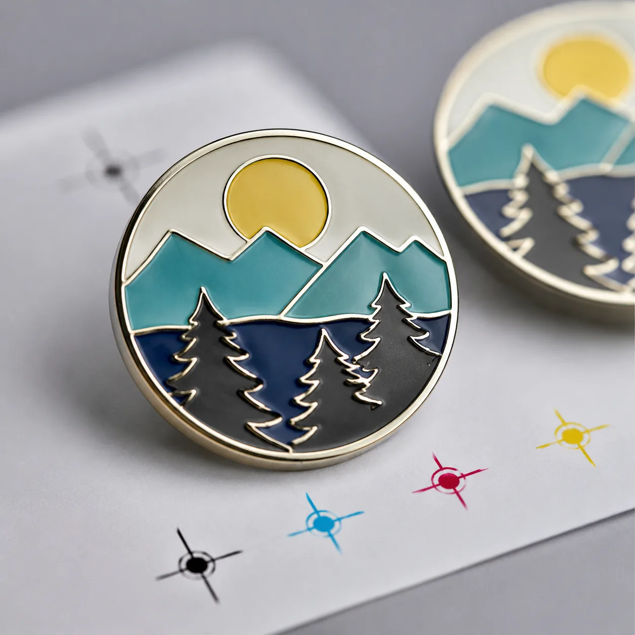
Most buyers focus on color, finish, and MOQ, but the orders that get rejected usually fail on registration: one color creeps into another, a border shifts off center, or a logo lands outside its keyline. On small promo items, a 0.2 to 0.3 mm shift is often visible, especially on enamel pins, printed keychains, woven patches, and lanyards with fine text. Once artwork is approved without a registration spec, the factory will usually build to its own internal tolerance, which may be fine for one product and unacceptable for another.
The fix is not to ask for “better quality” in general terms. You need to define where alignment matters, how much deviation is acceptable, and which defects are cosmetic versus rejectable. That reduces sample rounds, prevents inspection disputes, and avoids the familiar rework cycle where everyone agrees the product is “close enough” only after it is packed.
In promo manufacturing, registration is a measurable relationship between layers, print passes, cut lines, and raised boundaries. A clean spec gives the supplier a target they can actually set up against, instead of a subjective instruction to make it look good.
What registration means by product type
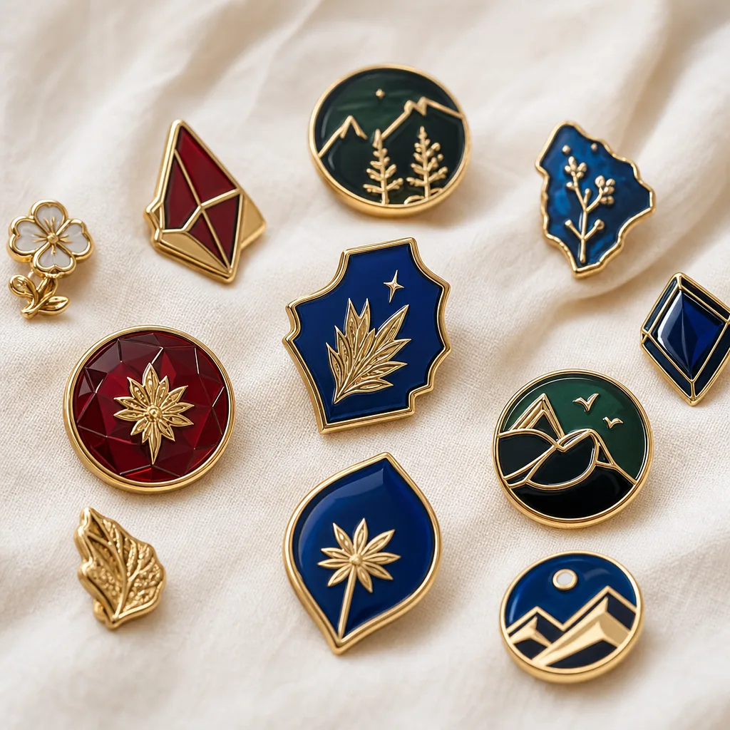
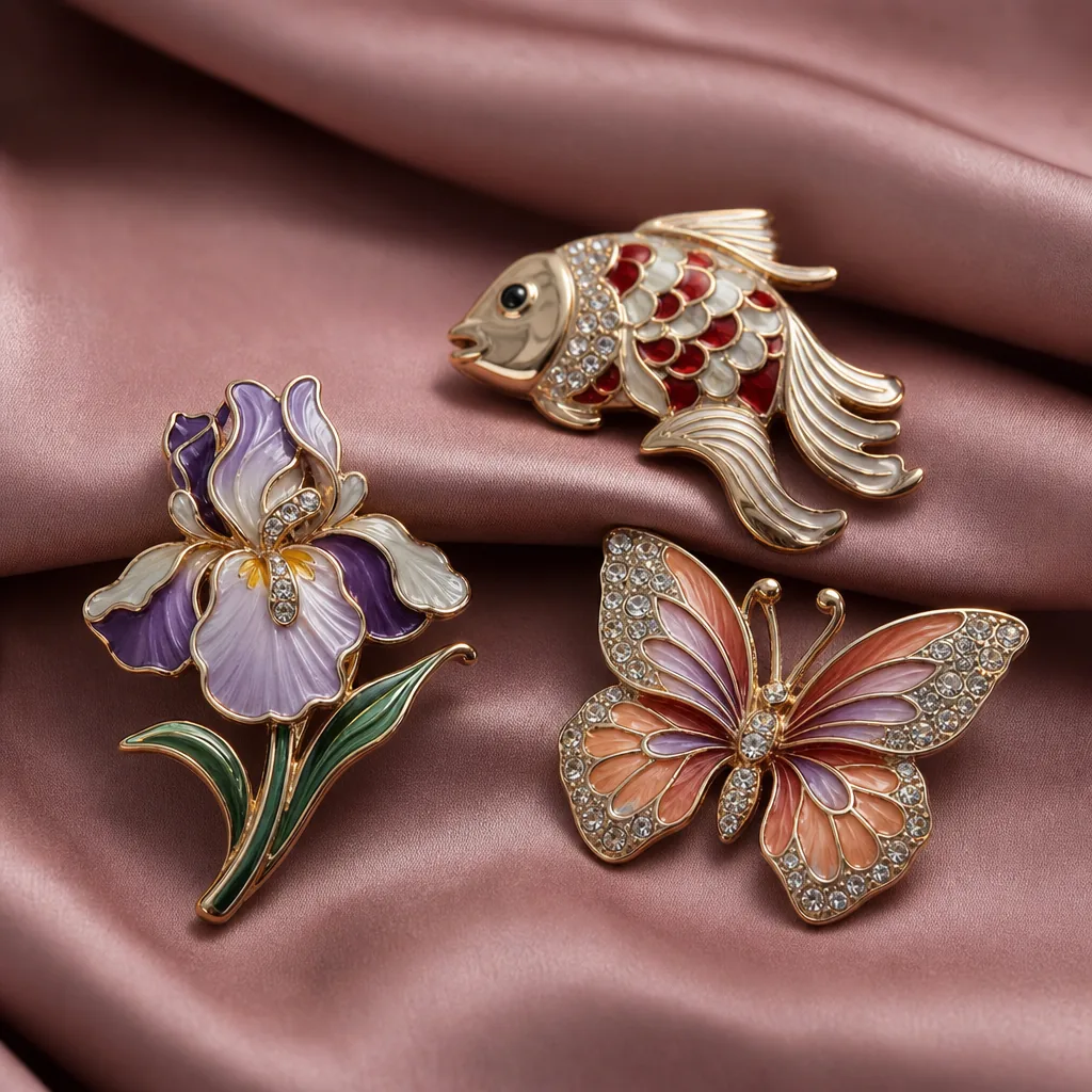
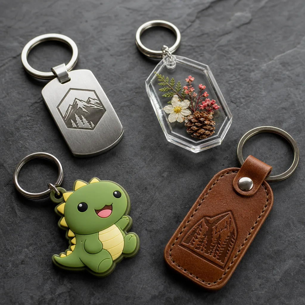
Registration means different things depending on the construction. On a hard enamel pin, it is the fit between metal channels and color fills. On a printed magnet or acrylic keychain, it is the relationship between the print and the die-cut edge. On a woven patch, it is the repeat position of the logo relative to the weave. On a lanyard, it is the spacing and consistency of repeated logos along the webbing.
Cast or die-struck products can hide small shifts because the raised metal creates a visual boundary. Fully printed products show mistakes immediately, especially with thin outlines, reverse text, and circles inside circles. That is why a sample made by a senior operator can pass while mass production drifts: the setup may be stable for 20 pieces, but not for 5,000.
- Use metal separators or keylines when artwork has multiple colors and sharp boundaries.
- Use bleed and overprint allowances on fully printed items to hide small edge movement.
- Treat small text, thin outlines, and symmetrical logos as registration-critical.
- State whether centered appearance or exact edge distance is the controlling requirement.
The numbers to specify before production
A useful registration spec has three parts: alignment tolerance, visible defect limit, and inspection method. For most small metal promo products, a practical target is ±0.15 to ±0.20 mm on critical keylines and ±0.30 mm on non-critical areas. For printed items such as PVC keychains or magnets, ±0.30 to ±0.50 mm is often acceptable if the design includes bleed and has no hairline text. For woven patches and lanyards, the control point is usually repeat consistency rather than a single edge, so the important metric is spacing variation across the repeat.
If you leave the tolerance blank, many factories will inspect to appearance only. That is risky when the buyer has a strict brand standard. A stronger RFQ defines one primary reference edge, one secondary reference edge, and the maximum visible shift under normal viewing distance of 30 to 50 cm. That gives the factory a measurable target instead of a subjective one.
For dimensioned parts, it also helps to specify the baseline tolerance for the substrate itself. Typical tooling tolerances are ±0.10 to ±0.20 mm on metal dies, ±0.20 to ±0.30 mm on injection-molded PVC, and ±0.3 to ±0.5 mm on stitched or woven products after trimming. If the artwork tolerance is tighter than the substrate tolerance, the spec is unrealistic and should be redesigned.
| Product type | Typical registration target | What usually matters most |
|---|---|---|
| Soft enamel pin | ±0.15 to ±0.20 mm on keylines | Color separation and border centering |
| Printed keychain | ±0.30 to ±0.50 mm | Artwork-to-cut alignment and edge bleed |
| Fridge magnet | ±0.50 mm | Print position relative to die-cut edge |
| Woven patch | Pattern repeat within 1 warp/weft unit | Logo clarity and repeat consistency |
| Lanyard print | Logo repeat ±2 to ±3 mm | Spacing consistency along the length |
How to write a useful registration spec
The best spec tells the supplier what to measure and what to ignore. If a logo has a circle with text inside, the circle edge may be the critical element while the inner text can tolerate slightly looser centering as long as it remains legible. If a pin has a fine outline around a filled shape, the outline should be the reference because it preserves the visual edge. On two-sided products, state whether front and back are independent or must match.
A strong RFQ should include the artwork file format, the intended viewing distance, the critical features, and the reject criteria. It should also say whether color shift is allowed if the border remains clean, or whether both color and border alignment must pass together. Buyers who define those rules early get cleaner samples and fewer disputes during final inspection.
For complex artwork, add a control note such as: “Outer circle and text baseline must stay centered within ±0.2 mm; inner icon may vary within ±0.3 mm provided no edge overlap occurs.” That is much easier for a factory to follow than “keep it centered.”
- State the reference point: outer edge, keyline, center mark, or repeat interval.
- State the tolerance in millimeters for each critical feature.
- State the viewing distance: close inspection, arm’s length, or display use.
- State the reject condition: overflow, offset, blur, ghosting, or mismatch.
- State whether samples must match digital proof, Pantone swatch, or signed golden sample.
Artwork prep that prevents avoidable misregistration
Many registration problems start in the artwork file, not on the production line. Thin strokes below 0.20 mm, tiny reverse text, and crowded shapes reduce the factory’s margin for error. If the design relies on exact overlap between two colors, convert it to a keyed layout with trapped edges or a shared boundary instead of two separate shapes that must meet perfectly.
For printed items, provide a vector file with separate layers for cut line, bleed, white underbase, and print colors. For enamel items, provide a clean vector with clear color separation and a note identifying which lines are raised metal. If the design has a gradient, shadow, or photo image, do not force it into a process that expects hard registration; move it to UV print, offset print, or epoxy-coated print instead.
A practical artwork rule set is: minimum positive line width 0.25 mm for screen-printed details, minimum reverse text height 1.8 to 2.0 mm for enamel or pad print, and at least 1.0 mm of trap between adjoining colors where edge contact is critical. Those numbers are not universal, but they are far safer than art with hairline gaps and no bleed.
Inspection rules that catch drift early
Inspection should happen at three points: first article, in-process, and final audit. First article checks whether the setup matches the approved spec before the line runs. In-process checks catch drift from tooling wear, plate shift, or operator setup changes. Final inspection confirms the packed goods match the approved standard, but by then the cost to fix problems is much higher.
Use the right defect framework for the item. For standard promo orders, many buyers use AQL 2.5 for major defects and AQL 4.0 for minor defects, with a sample size based on lot size. For stricter retail or launch programs, many sourcing teams tighten to AQL 1.0 to 1.5 for majors and 2.5 for minors. A registration defect is major if it affects logo readability, color separation, or brand recognition; it is minor only if it is invisible at the stated viewing distance and does not affect function.
The inspection note should also name the measurement method. For example, use a 10x loupe for micro text, a steel ruler or caliper for cut-to-print offsets, and a printed comparison chart for repeat spacing. If the factory and buyer use different methods, they may both be “right” and still disagree.
| Defect type | Example | Suggested classification |
|---|---|---|
| Major | Logo boundary shifted enough to expose base metal | Reject |
| Major | Printed text overlaps cut edge | Reject |
| Minor | Tiny offset not visible at 50 cm | Conditional accept |
| Minor | Slight repeat spacing variation on lanyard | Conditional accept |
| Critical | Misread brand name or wrong color block | Reject |
When to tighten or relax control
Not every product needs a laboratory-level spec. If the item is a low-cost giveaway with bold artwork and no fine text, looser tolerance can lower scrap and speed production. If the item is a launch gift, collector piece, or retail accessory, tighter control is worth the cost because visible drift directly damages brand perception. Match tolerance to the commercial role of the product, not just the unit price.
As a sourcing guide, simple printed giveaways often quote FOB China around USD 0.15 to 0.60 per piece at 3,000 to 10,000 units, while metal promo products with tighter registration control commonly sit around USD 0.40 to 2.50 per piece at 1,000 to 5,000 units. Minimum order quantities vary by process: screen-printed keychains may start at 500 to 1,000 pieces, soft enamel pins at 100 to 300 pieces, woven patches at 500 pieces, and lanyards at 300 to 1,000 pieces depending on width and attachments.
Typical lead times are 3 to 7 days for sampling, 10 to 18 days for standard production, and 18 to 30 days for multi-process or multi-color orders that require extra proofing. If a supplier promises extremely fast delivery without discussing registration controls, that is usually a warning sign. A rush order can still be good, but it should come with clear limits on acceptable artwork complexity and fewer color boundaries.
A sensible rule is to tighten control when the design has thin text, adjacent spot colors, a centered logo, or buyer-facing packaging. Relax control only when the graphic is bold, the viewing distance is long, or the product is promotional rather than retail-grade.
A practical specification checklist
Use this checklist before sending the RFQ or approving the pre-production sample:
- Confirm the product type, print method, and substrate before setting tolerance.
- Mark the primary reference edge and the secondary alignment edge on the artwork.
- Specify numeric tolerances in mm for each critical feature.
- State the required viewing distance and the reject threshold.
- Define the AQL level and whether registration is a major or critical defect.
- Request a signed golden sample for any design with fine text or nested shapes.
- Ask the supplier to confirm MOQ, FOB price range, and lead time in writing.
- Require first article photos with a ruler, caliper, or loupe reference.
For mixed-item promo sets, keep the same visual reference across all items so the buyer sees one brand standard instead of several approximations. That consistency matters more than a perfect technical score on one item and a loose interpretation on another.
What to do next
Before your next RFQ, mark the exact features that must align, the maximum allowable shift, and the inspection distance. Ask for a pre-production sample measured against those rules, not just judged by eye. If the design is high-risk, require a signed golden sample and use the same reference in final inspection.
A good registration spec is short, numeric, and visual. If you can reduce it to critical feature, tolerance in millimeters, and reject condition, you will eliminate most disputes on pins, magnets, keychains, patches, and lanyards. The result is fewer reprints, cleaner approvals, and a supplier that knows exactly what “acceptable” means before production starts.
Have a project? Send your artwork and target quantity and we’ll reply with a detailed quotation within 12 working hours.
Ready to get this made?
Send your sketch, target quantity and ship-date. Detailed quotation in 12 hours.