How to Specify Brand-Consistent Colors Across Promo Products
Why brand color drifts across product lines
The most common complaint in mixed promo orders is not that a pin, patch, or lanyard is badly made. It is that the same brand blue looks different once production starts. That happens because each product uses a different material system, finish, and decoration method, so one Pantone code is only the starting point, not the full specification.
A hard enamel pin, a woven patch, and a sublimated lanyard will never reflect light the same way. Metal plating increases contrast at the color edge, textiles absorb light, and printed polyester can shift slightly under heat. If you do not control those variables, you can approve three samples and still receive a set that looks inconsistent in hand.
The fix is to define one master reference, then translate it correctly by product type. In practice, that means naming the brand color, the finish family, the acceptable tolerance, and the approval method for each item. For mixed kits, this is the difference between a clean campaign and a remake request.
Choose one master color system first
Start with a single master reference that the entire program follows. For coated metal products, Pantone Solid Coated is usually the most workable reference. For textiles, a fabric-dye standard or a Pantone reference converted through a thread or print library is more realistic than a direct paint-style match.
Do not treat RGB, CMYK, or a website hex code as the production standard. Those values are useful for design files, but factories build from physical substrates, not screens. If your brand guide only provides digital values, convert them to a physical standard and approve that standard under neutral light before quoting starts.
If the brand has a formal style guide, use the exact stated code and note whether it is the primary logo color, a secondary accent, or a campaign-specific variation. If the guide is weak, create a master swatch board and get sign-off from marketing and procurement. Once approved, every drawing, proof, and PO should repeat the same master reference verbatim.
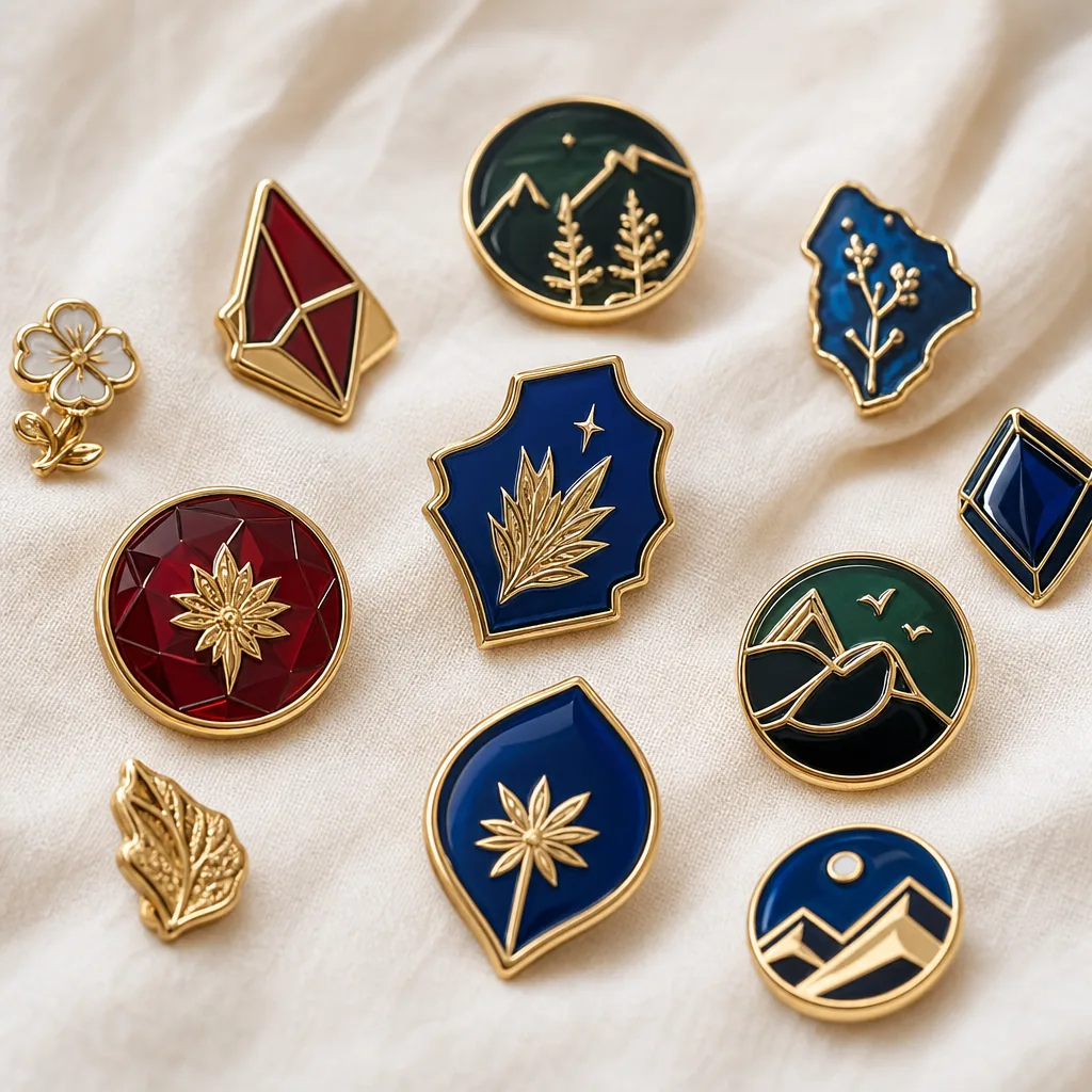
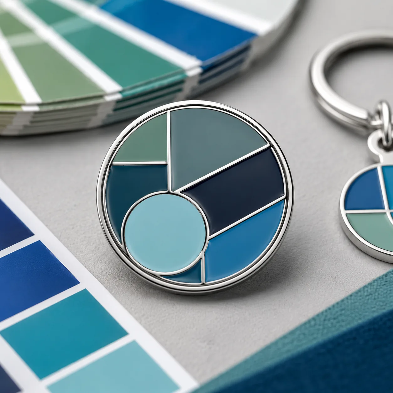
For example, a campaign might use Pantone 286 C as the master blue. The pin and coin can match that directly on enamel or print, while the lanyard may need a CMYK or yarn equivalent that visually lands within the same family. The goal is not identical chemistry; it is controlled visual consistency.
Use the right tolerance for each product
Color tolerance should not be one blanket rule across every item. Metal badges, hard enamel pins, embroidered patches, woven patches, sublimated lanyards, PVC keychains, and printed coins each have different practical limits. A woven patch may look slightly warmer than a printed insert even when both are technically on spec because the surface texture changes how the eye reads the shade.
For procurement, the best practice is to define both a visual target and a measurable tolerance where the supplier can actually measure it. On smooth surfaces such as printed metal, a Delta E tolerance of 1.5 to 2.5 is a reasonable target when measured against the approved master under D65 light. On textile and textured products, a visual match to an approved physical sample is more reliable than chasing a numeric value the substrate cannot hold consistently.
Use the table below as a practical starting point. It is not a universal standard, but it is a solid baseline for RFQs and PO language when one brand palette must run across several factory processes.
| Product | Recommended spec | Practical tolerance | Typical MOQ | Typical lead time | FOB price range |
|---|---|---|---|---|---|
| Hard enamel pin | Pantone master + approved plated sample | Visual match to approved sample; Delta E 1.5-2.0 on flat color fields | 100-300 pcs | 12-18 days | USD 0.55-1.60/pc |
| Soft enamel pin | Pantone master + line-art proof + sample | Slight edge contrast allowed; Delta E 2.0-3.0 | 100-300 pcs | 12-18 days | USD 0.40-1.20/pc |
| Die-struck coin | Pantone or enamel insert reference + finish note | Visual match on filled areas; antique/plated contrast approved separately | 100-500 pcs | 15-22 days | USD 0.80-3.50/pc |
| Woven patch | Thread chart reference + strike-off | Match to approved strike-off; accept small texture shift | 100-500 pcs | 10-16 days | USD 0.20-0.85/pc |
| Embroidered patch | Thread card + stitch-density note | Match by thread family; allow 1 shade step for raised stitching | 100-500 pcs | 10-18 days | USD 0.25-1.10/pc |
| Sublimated lanyard | Pantone-to-CMYK conversion + print proof | Delta E 2.5-4.0 acceptable on full-coverage print | 100-300 pcs | 8-14 days | USD 0.18-0.65/pc |
| PVC keychain | Pantone master + molded color chip | Visual match to chip; minor batch variation allowed | 100-300 pcs | 12-20 days | USD 0.32-1.40/pc |
If you need tighter control, request a pre-production sample from each product family rather than relying on one “master sample” for all items. A sample made in metal and enamel does not predict how a polyester lanyard or thread-based patch will behave. Different materials need different acceptance standards.
Match finish before you match color
Two items can share the same color code and still look wrong if one is matte and the other glossy. Finish changes reflectivity, which changes perceived saturation and darkness. That is why buyers often think the factory got the color wrong when the real problem is that the finish spec was never aligned.
Decide early whether the brand should read as bright, premium, muted, or playful. Bright programs usually use polished metal, glossy epoxy, and saturated print. Premium programs lean toward antique plating, brushed metal, lower-sheen ink, and tighter color contrast. If you skip that decision, the factory may deliver technically correct products that still look unrelated on the table.
A useful rule is to lock finish family before final art approval. For example, a soft enamel pin with black nickel plating will read deeper than the same art on silver plating. A woven patch will also read slightly darker than a screen-printed patch because thread density reduces light bounce. These are design decisions, not defects, and they should be written into the spec.
If the campaign includes both gloss and matte items, define which one is the visual anchor. Many brands choose the pin or coin as the anchor because metal samples are easier to compare physically. The other products can then be matched to that anchor by visual family rather than by forcing every item into one numeric target.
What to specify in the RFQ and PO
Your RFQ should tell the supplier exactly what color authority to use, how each product converts that reference, and what happens if the first sample differs. If you only write “match brand color,” you invite interpretation. Different factories may match to Pantone books, local thread charts, printed PDFs, or internal resin stock, and those standards are not interchangeable.
A strong RFQ includes the master reference, finish family, decoration method, tolerance basis, approval step, and reorder rule. It should also name whether the supplier may propose a closest-production match if the original color is not achievable on a given substrate. That prevents later disputes when a textile or molded part cannot exactly reproduce a coated-metal target.
Use this checklist in the RFQ or PO package:
- State one master color reference for the full program.
- List each product and its decoration method separately.
- Attach physical swatches, approved samples, or thread cards where possible.
- Define finish family: glossy, matte, antique, brushed, or mixed.
- Set the approval method: digital proof, pre-production sample, or both.
- Require written factory confirmation before tooling or bulk production starts.
- Record the reorder reference, sample date, and product finish in one archive.
For higher-risk launches or brand-sensitive campaigns, require a physical pre-production sample for each product family. Digital proof alone is not enough for textured textiles, plated metal, or molded PVC because it cannot show surface shift, emboss depth, or ink density. A physical sample adds time, but it usually saves money versus a remake.
Where buyers usually lose control
The biggest failure point is changing artwork after sample approval without rechecking color interactions. A new outline thickness, larger logo, or different background fill can make the same color look darker or lighter. The color code did not change, but the visual balance did.
Another common problem is mixing suppliers. One factory may match a plated pin to a physical sample, while another factory matches a lanyard to a PDF image. That creates a visible mismatch even if both factories believe they are following the same brand standard. Whenever possible, centralize color authority in one master file plus one approved physical reference set.
Reorders are another trap. If the first order was approved from a physical sample but the reorder is placed from a PDF or old email thread, the factory may reproduce the wrong shade simply because the original standard was not archived. Keep the master sample code, plating type, finish, approval date, and buyer sign-off together as one reorder record.
Lighting also matters more than many teams expect. Daylight, warm office light, and warehouse LEDs will make the same object appear different. Evaluate final samples under neutral white light around 4000K to 5000K, and keep the same lighting setup for every approval round. If the team reviews samples in different rooms, color arguments become almost impossible to settle.
A practical control method for mixed kits
The most reliable way to control a campaign set is to assign one lead item as the color anchor and then adapt the others to it. For many brands, that anchor is the pin, coin, or badge because those items are easier to compare physically and usually hold color more consistently than printed textiles. Once the anchor is approved, the patch, lanyard, magnet, or keychain can be matched to the same visual intent.
This method works best when each item has its own production note. The pin may call for Pantone 286 C in soft enamel with black nickel plating. The patch may call for a thread equivalent close to 286 C with a strike-off approval. The lanyard may call for a sublimation proof converted from the same master and checked against a printed swatch board. That sounds more complex than one universal color line, but it reduces disputes because each process is judged realistically.
If the order is important enough to justify extra control, ask for a color board or set board before mass production. This is a one-page physical reference showing all items together so the buyer can confirm the visual family. For campaigns with tight brand governance, that board is often more useful than reviewing each item separately.
A good board should show the front view, plating or substrate note, approved color code, and the date of approval. If the factory can also provide an AQL-based inspection plan, ask for that too. AQL 2.5 is common for general visual defects, while color-related claims should be tied to the approved sample rather than to a loose subjective description like “close enough.”
What to do next
If you are preparing a multi-item promo order, build a one-page color control sheet before requesting quotes. Put the master Pantone reference, the finish family for each product, the approval sample requirement, and the reorder rule in the same document. That single sheet eliminates most of the guesswork that causes brand mismatch later.
For your next RFQ, ask the supplier to confirm three things in writing: what reference they will match, what sample they will use as the standard, and how they will handle acceptable variation on different materials. If the supplier cannot answer those three points clearly, the color risk is too high to leave vague.
As a final procurement check, confirm MOQ, lead time, and inspection basis before artwork is released. A typical mixed order may start at 100 to 300 units per SKU, with 8 to 22 days of production depending on complexity and plating. When you lock the color spec up front, the supplier can quote more accurately, the approval cycle shortens, and the finished kit looks like one brand instead of four separate products.
Have a project? Send your artwork and target quantity and we’ll reply with a detailed quotation within 12 working hours.
Ready to get this made?
Send your sketch, target quantity and ship-date. Detailed quotation in 12 hours.