Custom Promo Product Spec Sheets: How to Read Each Line
Why spec sheets fail at the line level
Most production problems on custom metal giveaways start before tooling, not in the press room. A buyer signs off a sheet that looks complete, but key fields are vague, duplicated, or internally inconsistent. One line says 1.2 mm thickness, another says heavy feel, and the factory fills the gap with its own interpretation. That is how rework, quote drift, and sample disputes begin.
A good spec sheet is not a formality. It is the contract the factory actually builds to, which means every line must be measurable, testable, and tied to one manufacturing decision. If a field does not change tooling, material, decoration, tolerance, packing, or inspection, it is probably just clutter. If it does change those things, it needs a number, a standard, or a clear acceptance range.
This article is structured like a spec-sheet deep dive, line by line. Use it to review what each field should say, what the factory is likely to assume, and where you need to lock the number yourself. The examples are written for pins, coins, badges, keychains, magnets, patches, and lanyards, because the same failure modes repeat across all of them.
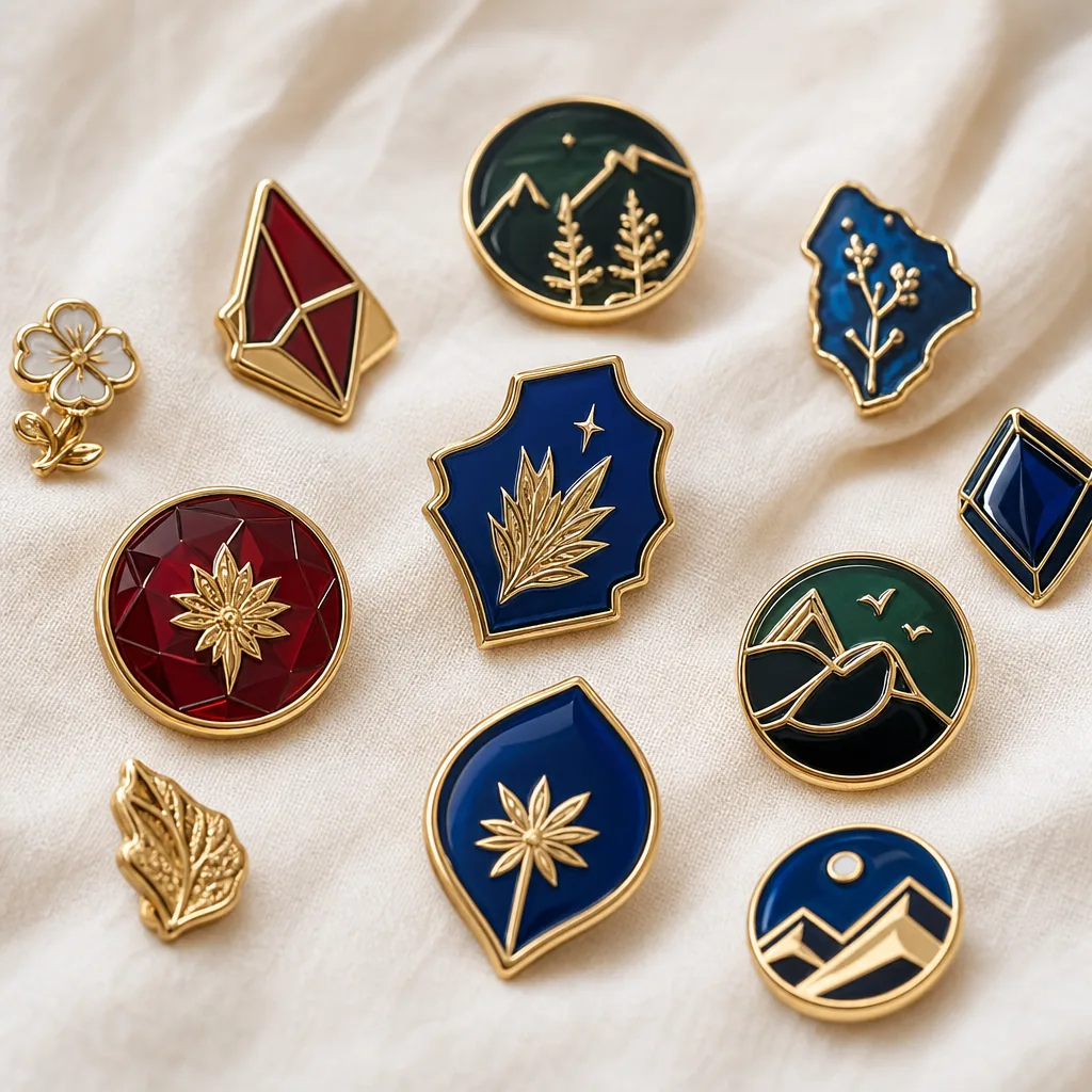
Line 1: product type and build method
The first line should define the product in manufacturing terms, not just marketing terms. For example, “lapel pin” is not enough if the build could be soft enamel, hard enamel, die struck, or printed with epoxy. The build method changes tooling depth, surface flatness, fill level, polish sequence, and unit price. If you do not specify it, the supplier will quote the easiest version to make, not the one you imagined.
For metal products, name both the category and the build. A useful line might read: custom soft enamel pin, iron base, 2D recessed fill, black nickel plating, butterfly clutch backing. For patches or lanyards, the equivalent is embroidery type, backing style, print method, and attachment style. For fridge magnets and keychains, the substrate and insert method matter just as much as decoration.
- Do not rely on a retail-style product name alone
- State the build method, base material, decoration, and backing on the same line
- If there are variants, split them into separate spec rows
- Treat hidden manufacturing choices as quote drivers, not optional details
Line 2: dimensions, thickness, and tolerance
Dimensions should always be written as finished size, not artwork size, unless the artwork itself is the tool boundary. For pins and badges, buyers often confuse the visible outer edge with the metal outline, which creates a mismatch after plating and polishing. A badge listed as 30 mm can easily come back 29.4 mm or 30.6 mm depending on edge style and tolerance. The more complex the silhouette, the more you need to specify what is measured and from where.
Thickness needs the same discipline. A 1.5 mm stamped pin, a 2.0 mm coin, and a 3.0 mm keychain body all feel different in hand and also behave differently in casting, polishing, and packing. If the item must sit flat, carry enamel evenly, or survive repeated wear, thickness range matters more than nominal thickness alone. A practical tolerance for many small metal promo items is ±0.2 mm on thickness and ±0.3 mm on linear dimensions, but the exact range should match the build and tooling complexity.
| Spec line | Poor example | Better example |
|---|---|---|
| Size | 30 mm | 30 mm finished diameter, ±0.3 mm |
| Thickness | Heavy feel | 1.8 mm finished thickness, ±0.2 mm |
| Edge | Smooth edge | Raised rim 0.3 mm above fill, no sharp burrs |
| Openwork | As per artwork | Minimum internal bridge 0.8 mm, no islands smaller than 1.2 mm |
Line 3: material and plating stack
Material is not just a price line; it controls weight, edge sharpness, corrosion behavior, and yield. Iron is usually the lowest-cost choice for stamped pins and badges, but it is less forgiving than zinc alloy on deep relief or thick casting. Brass gives cleaner detail and a more premium finish, but the price can rise quickly on larger runs. Zinc alloy works well for 3D shapes, moving parts, and thick bodies, but it is usually unnecessary for simple flat items.
Plating should be written as a full stack, not a color name. “Gold” is ambiguous; “bright gold nickel plating, 0.1 to 0.15 micron flash” is much more usable. For cosmetic metal goods, buyers commonly specify 0.1 to 0.3 micron decorative flash plating, while heavier wear resistance may call for thicker or multi-layer systems depending on the base and finish. If the product will be handled daily, packed with other items, or used outdoors, ask for corrosion expectations and salt-spray assumptions in writing rather than assuming “gold” means durable.
This line is where honest trade-offs matter. Black nickel gives a strong contrast and hides fingerprints better than bright silver, but it can show abrasion differently under hard use. Antique finishes are forgiving on surface imperfections, but they are not the right choice when you need a clean corporate look. If the product is for a reorder program, lock the exact plating recipe because small process changes can shift color and sheen across batches.
Line 4: decoration depth, fill, and surface finish
Decoration specs are where many “looks fine in the mockup” orders fail. Enamel fill height, recessed depth, polish level, and textured versus mirror zones all need to be stated because they change both appearance and scrap risk. Soft enamel usually leaves recessed metal lines proud; hard enamel is ground flatter and can tolerate a more premium polish, but it is less forgiving when the artwork has tiny compartments. If your design depends on a clean surface plane, say that explicitly.
The practical spec is not “high gloss” or “matte.” It is mirror polish on raised areas, satin texture in recessed fields, or debossed cavities filled flush to the rim. For epoxy dome coating, specify the dome height, edge coverage, and whether the coating may extend beyond the printed area. For laser engraving, you should define contrast target and depth expectation, because shallow mark only and deep burn both count as “engraved” unless you say otherwise.
A useful rule: any visible area should have one owner. Either it is plated metal, painted enamel, printed ink, texture, or clear coat. Mixing all five without a priority order invites conflict in sample approval. If two finishes touch, define which one wins at the boundary and what acceptable overlap looks like, even if the overlap is only 0.2 mm.
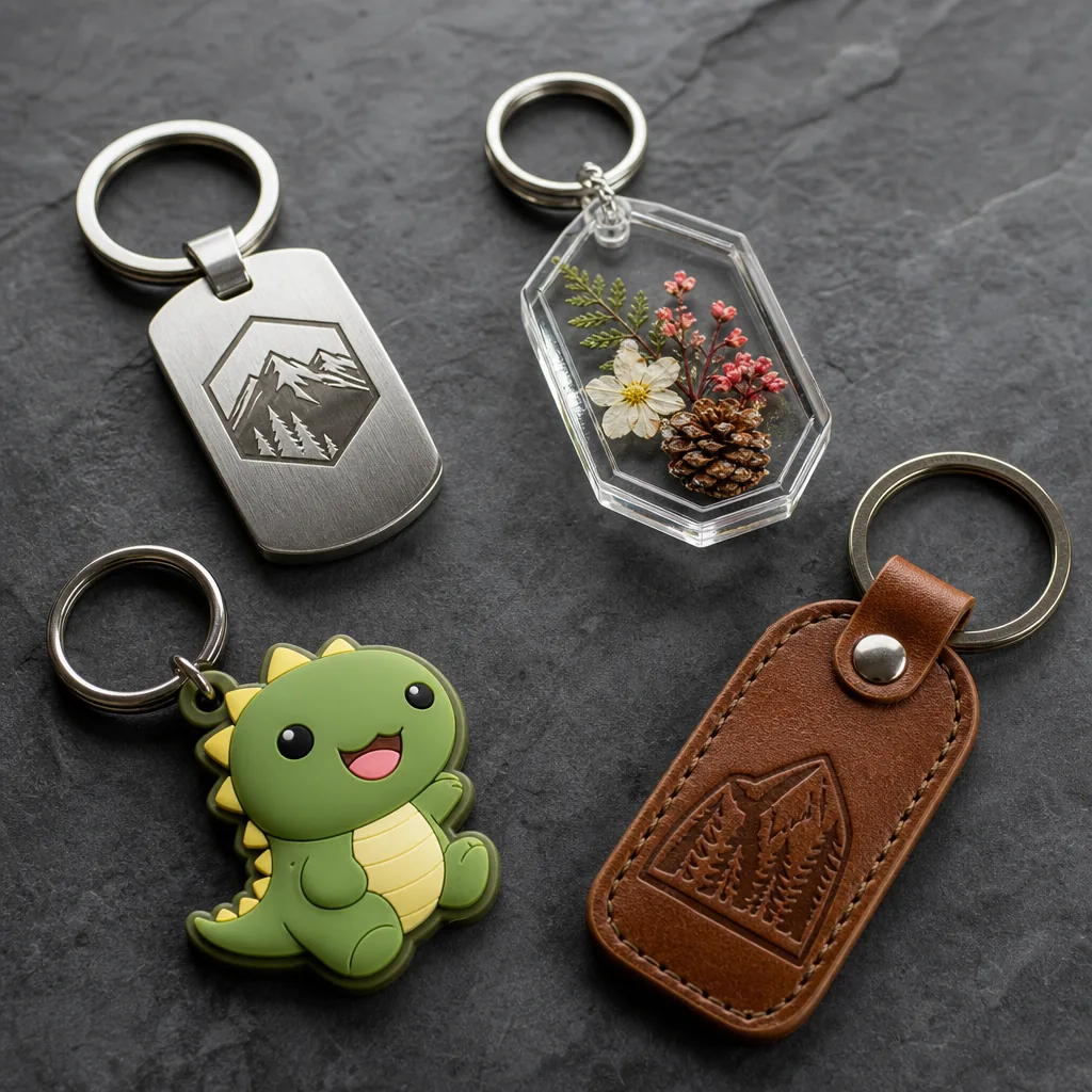
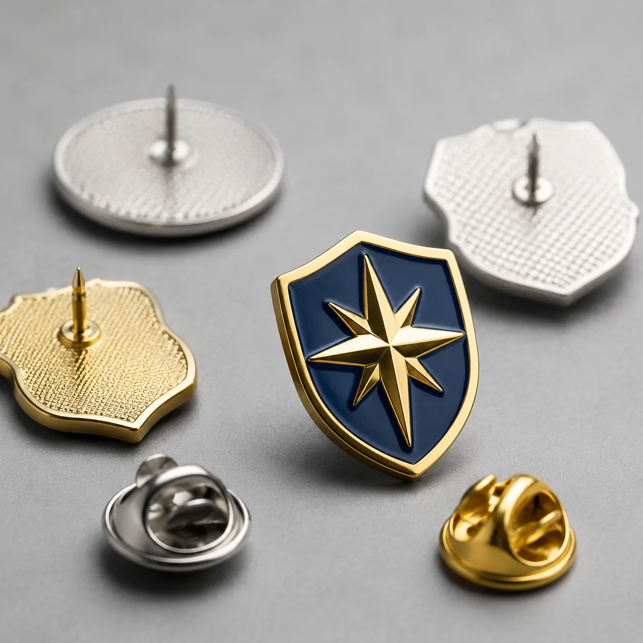
Line 5: attachment, hardware, and functional parts
Hardware is often treated as an afterthought, yet it drives field failure more than decoration does. A lapel pin backing, keychain split ring, magnet size, brooch clasp, lanyard hook, or coin capsule all have load and wear limits. If the wrong attachment is used, the product may pass appearance inspection and still fail in the hands of the end user. That is why the attachment line should specify both type and performance expectation.
For pins and badges, define the attachment style and the retention requirement. A butterfly clutch is compact and common, but it may not be ideal for heavy items or fabric-sensitive garments. Rubber clutches reduce fabric damage but can relax over time. For magnets, state diameter, grade, and pull target in practical terms, because a magnet that is “strong” in the sample box may still fail on thick fabric or cardboard.
For keychains and coins, hardware should be tied to use case. If the item will hang from a bag, a split ring with a minimum wire thickness and opening durability matters more than the plating color. If the product is a premium coin, a capsule or presentation case may be part of the spec rather than an add-on. When moving parts are involved, specify clearance and anti-rattle expectations, or the factory may ship something that technically moves but sounds cheap.
Line 6: inspection rules, defect limits, and AQL
Inspection language should be written as acceptance rules, not praise. “Good quality” does not help a QC team decide whether a speck, scratch, plating void, or print shift is acceptable. For small promo products, a common starting point is AQL 2.5 for major defects and AQL 4.0 for minor defects, but the actual level should depend on order value, end use, and whether the item is for retail, event giveaways, or internal promotions. If your brand cannot tolerate visible variation, the limit should be tighter and the cosmetic zones should be defined.
Defect definitions need to be specific. A scratch on a hidden back surface may be minor, while the same scratch on a black nickel face is major. Color mismatch should be measured against an agreed sample or Pantone target where relevant, but you also need to define how much drift is allowed between cavities or across batches. Flatness, burrs, plating pits, enamel overflow, print misregistration, and loose hardware should each be listed separately.
If you only have room for one quality rule on the sheet, make it this: reference sample overrides catalog photos. Photos are interpretive; a signed sample is enforceable. For repeat orders, keep the golden sample, production sample, and inspection criteria aligned so the factory does not “improve” one attribute while degrading another. Consistency is usually more valuable than perfection.
Line 7: packing, labeling, and carton control
Packing specs determine how much damage the product absorbs between final inspection and delivery. A polished pin tossed into a loose polybag behaves differently from the same pin taped into a backing card and boxed in bulk. If you want scratch control, the packing line needs to mention individual bagging, separator sheets, insert cards, tray orientation, and carton count. For lanyards and patches, folding method and moisture protection matter more than many buyers expect.
Labeling is also a production control tool. Carton marks should match SKU, quantity, country of origin if required, and any buyer-specific warehouse code. If you ship mixed variants, tell the factory how the variants are segregated and whether inner cartons can be mixed or must be single-SKU only. A loose packing instruction causes warehouse confusion faster than a bad design file.
You should also define carton density and protection level. Overpacked cartons crush corners; underpacked cartons waste freight and raise movement damage. For FOB quotes, ask what the factory assumes for inner pack count, master carton count, and gross weight, because freight cost can swing based on those assumptions even if unit price looks stable.
What to do next
Take your current spec sheet and audit each line against three questions: can it be measured, can it be tested, and can the factory build to it without guessing. If the answer is no, rewrite that line before you request the next quote or sample. Focus first on product type, dimensions, material/plating, decoration, hardware, inspection, and packing, because those seven areas drive most rework.
If you want a clean reorder program, freeze the specs in a short golden-sample document and reuse the exact wording on every PO. That approach works especially well for mixed promo sets, where pins, keychains, coins, patches, magnets, and lanyards must all match one brand standard without surprises. ZheCraft typically helps buyers turn rough product ideas into line-by-line manufacturing specs, then checks that the sample, quote, and mass-production sheet all say the same thing before approval.
Have a project? Send your artwork and target quantity and we’ll reply with a detailed quotation within 12 working hours.
Ready to get this made?
Send your sketch, target quantity and ship-date. Detailed quotation in 12 hours.